

Cloudinary Builds MediaJams, A Rich Media dev learning platform featuring articles with accompanying code sandboxes, allowing developers to practice as they read.
The platform allows users to do some notes during reading, bookmark, and follow authors with handy navigation that is available from any page.


Fully responsive dev learning platform design with the ability to do some notes during reading, bookmark, follow authors, quickly navigate from any page. Design system and clear guidelines for further development including detailed typography and spacing.


One of the most important solutions was to make the main navigation handy and useful, so we showed the significant features as main menu items and put all secondary under a separate menu. Also, the navigation is collapsable, so users can focus on reading.
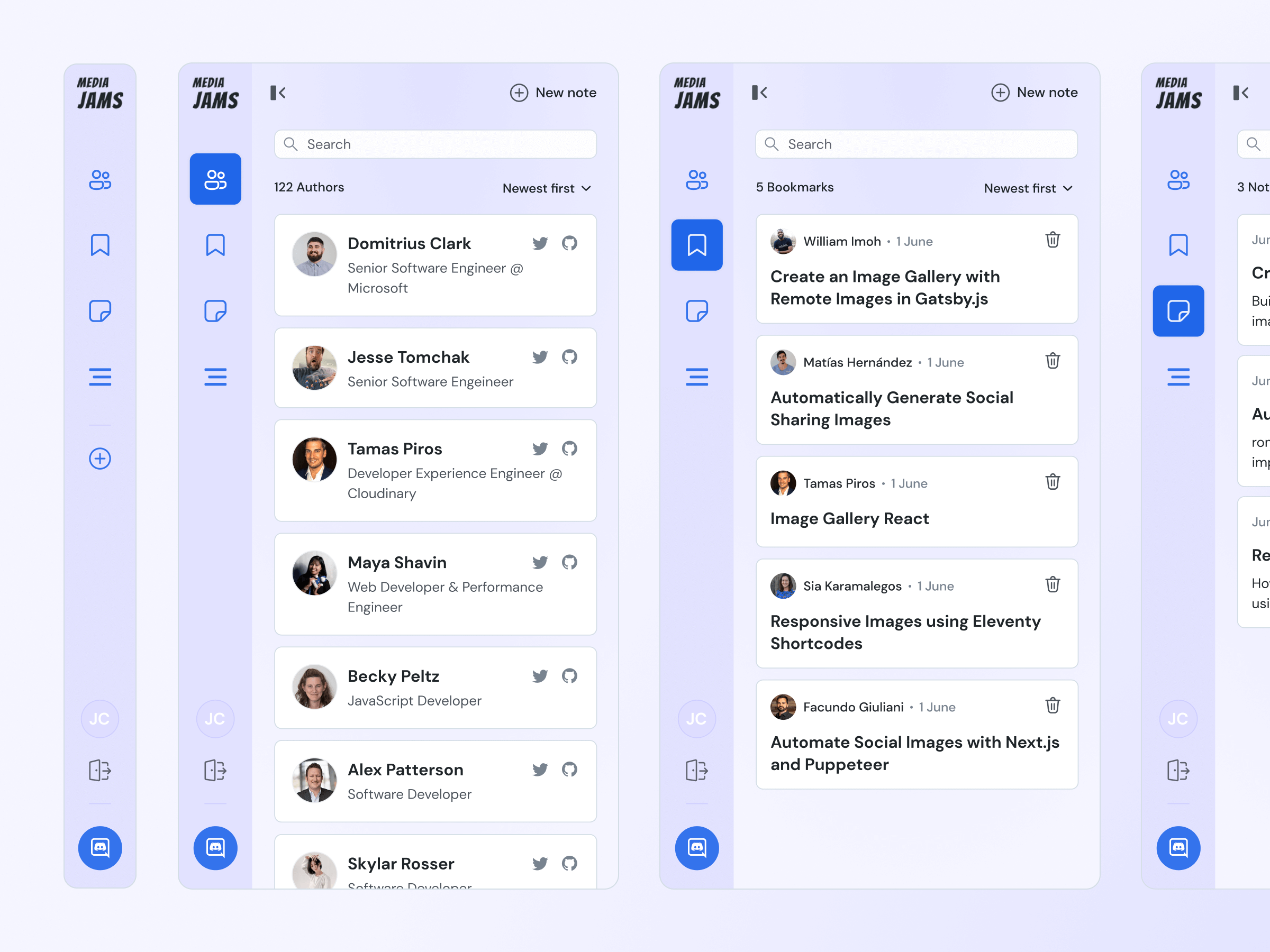
One of the most important solutions was to make the main navigation handy and useful, so we showed the significant features as main menu items and put all secondary under a separate menu. Also, the navigation is collapsable, so users can focus on reading.
One of the most important solutions was to make the main navigation handy and useful, so we showed the significant features as main menu items and put all secondary under a separate menu. Also, the navigation is collapsable, so users can focus on reading.
One of the most important solutions was to make the main navigation handy and useful, so we showed the significant features as main menu items and put all secondary under a separate menu. Also, the navigation is collapsable, so users can focus on reading.
One of the most important solutions was to make the main navigation handy and useful, so we showed the significant features as main menu items and put all secondary under a separate menu. Also, the navigation is collapsable, so users can focus on reading.
The main page was designed with the feed that users can search & filter as well as explore the featured content. The post template was improved with a post overview, new note feature, clear typography, and spacing. Also, we designed all the other pages like login & sign-up, user profile, submit feedback, and so on.
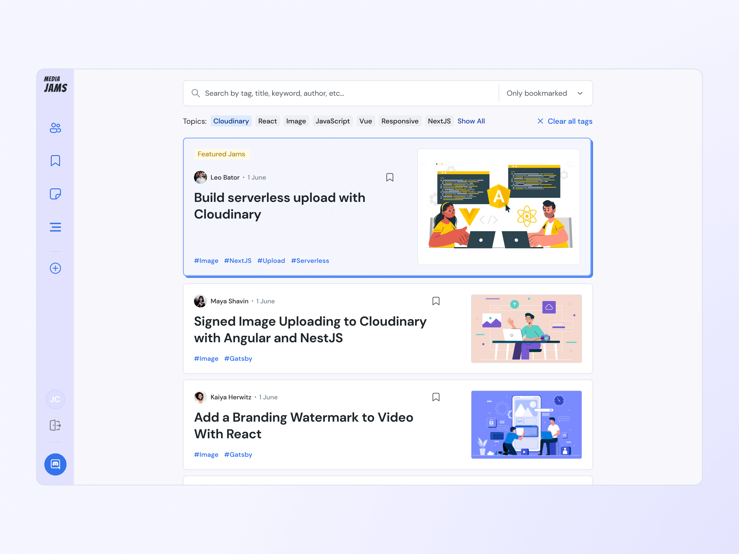
The main page was designed with the feed that users can search & filter as well as explore the featured content. The post template was improved with a post overview, new note feature, clear typography, and spacing. Also, we designed all the other pages like login & sign-up, user profile, submit feedback, and so on.
The main page was designed with the feed that users can search & filter as well as explore the featured content. The post template was improved with a post overview, new note feature, clear typography, and spacing. Also, we designed all the other pages like login & sign-up, user profile, submit feedback, and so on.
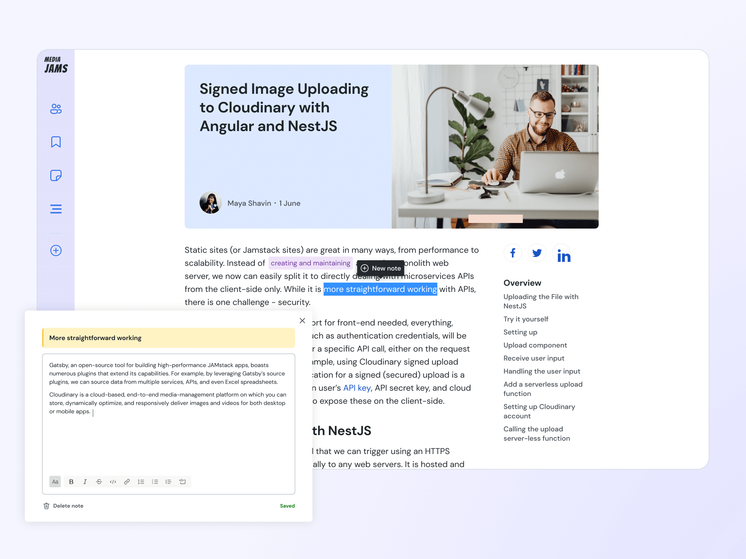
The main page was designed with the feed that users can search & filter as well as explore the featured content. The post template was improved with a post overview, new note feature, clear typography, and spacing. Also, we designed all the other pages like login & sign-up, user profile, submit feedback, and so on.
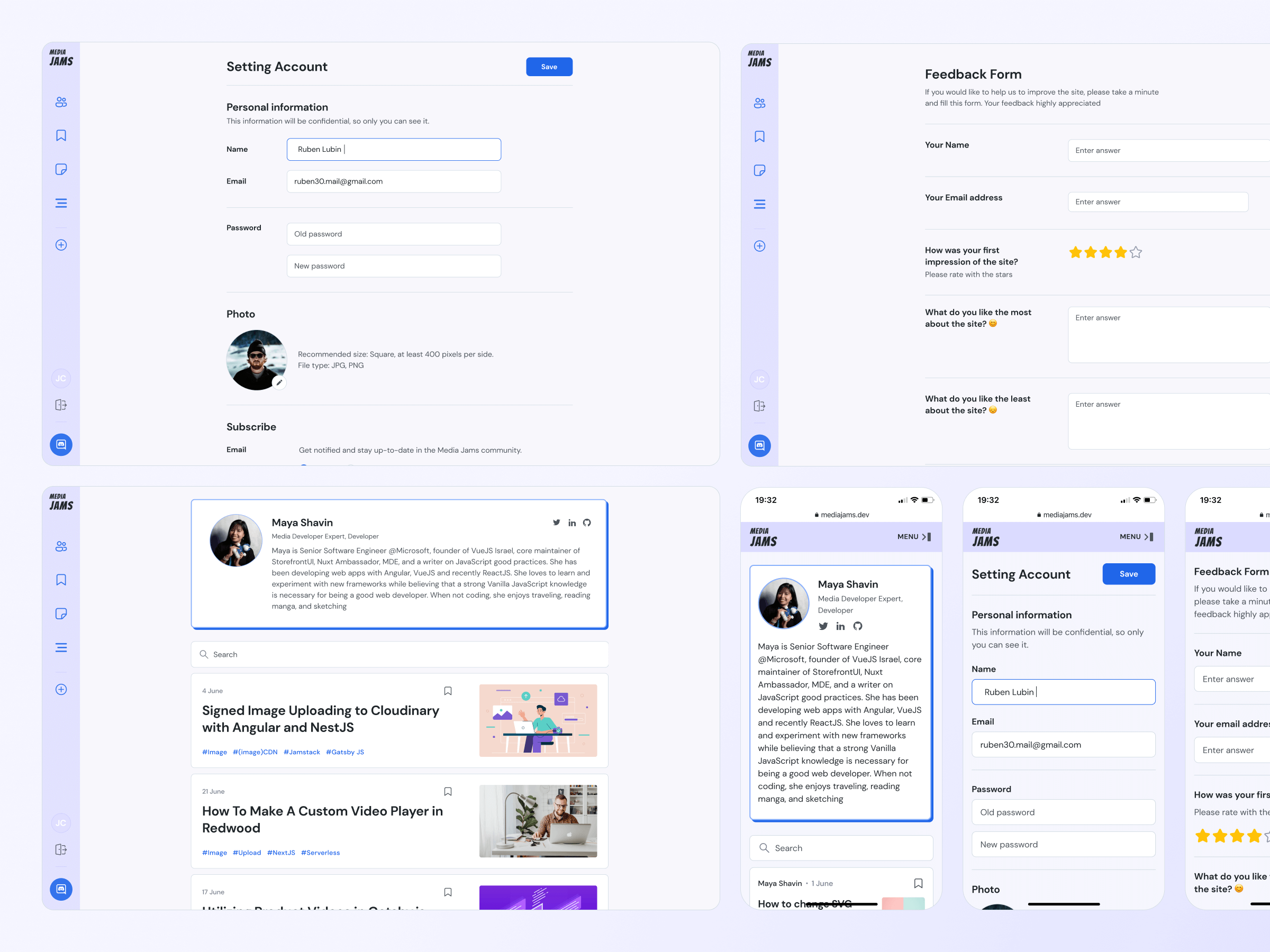
The main page was designed with the feed that users can search & filter as well as explore the featured content. The post template was improved with a post overview, new note feature, clear typography, and spacing. Also, we designed all the other pages like login & sign-up, user profile, submit feedback, and so on.
The entire website including the main navigation was fully adopted to tablet and mobile devices to make the platform user experience cross-devices.
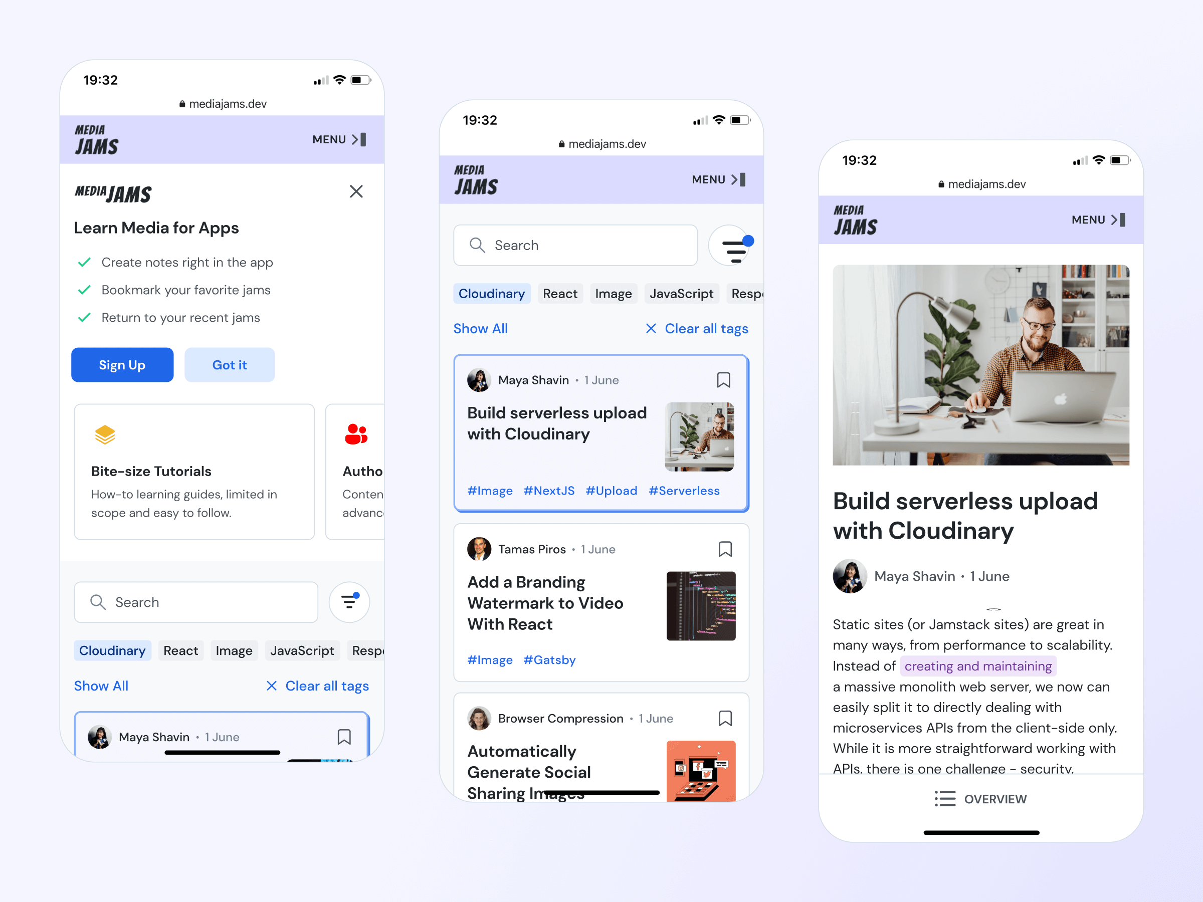
The entire website including the main navigation was fully adopted to tablet and mobile devices to make the platform user experience cross-devices.
The entire website including the main navigation was fully adopted to tablet and mobile devices to make the platform user experience cross-devices.
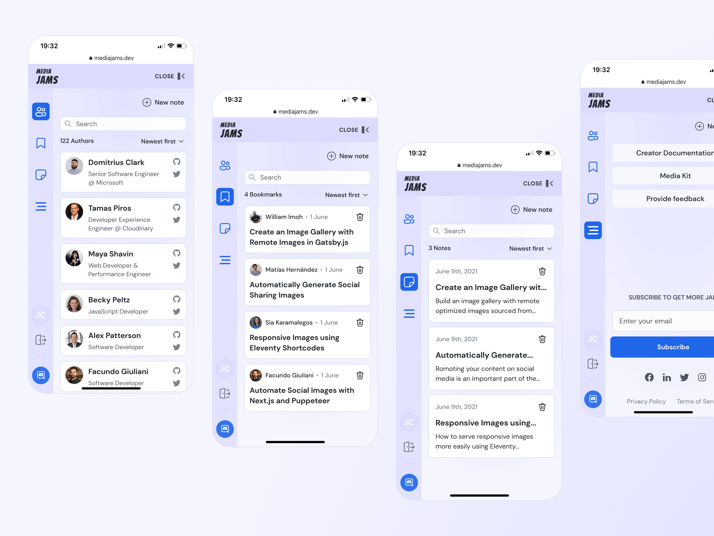
The entire website including the main navigation was fully adopted to tablet and mobile devices to make the platform user experience cross-devices.
The entire website including the main navigation was fully adopted to tablet and mobile devices to make the platform user experience cross-devices.
All the elements with their states, modules, templates, and responsive were gathered in one place with clear guidelines to make the handoff to devs smoother.
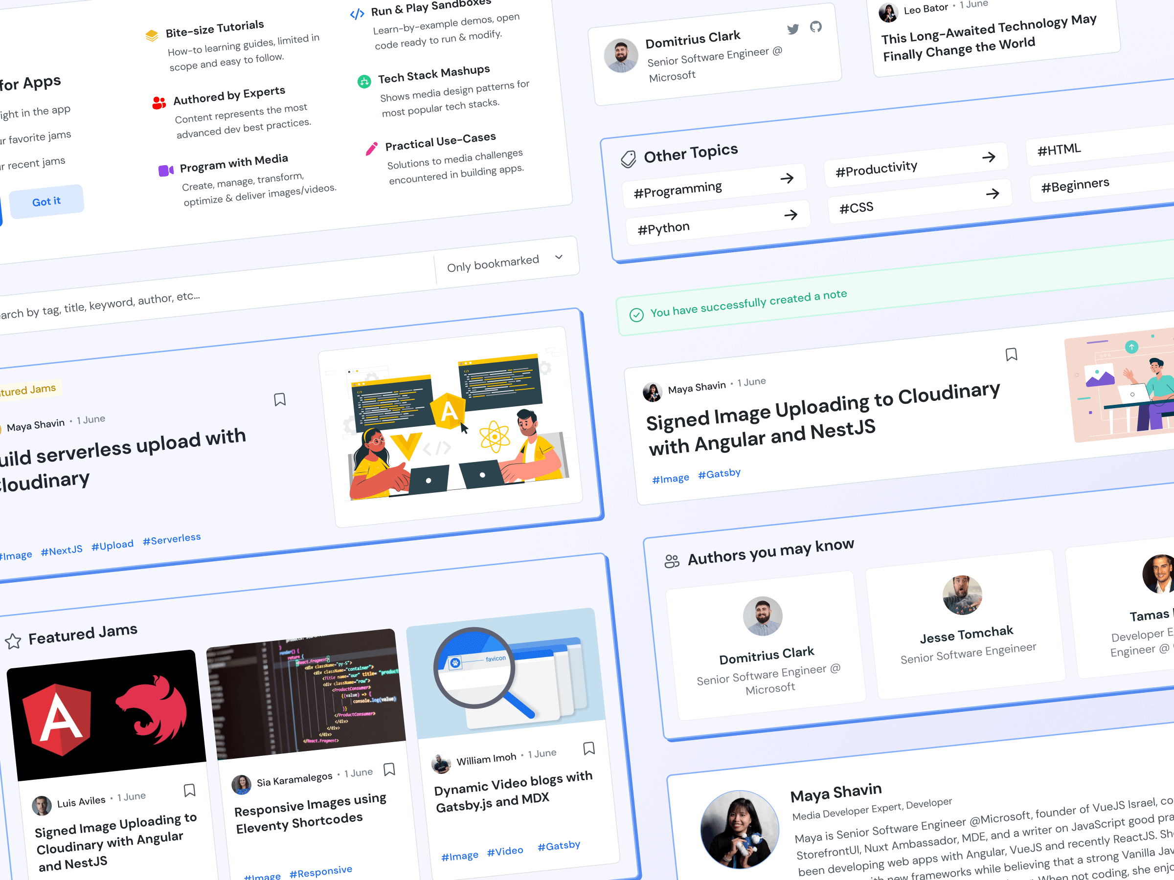
All the elements with their states, modules, templates, and responsive were gathered in one place with clear guidelines to make the handoff to devs smoother.
All the elements with their states, modules, templates, and responsive were gathered in one place with clear guidelines to make the handoff to devs smoother.
All the elements with their states, modules, templates, and responsive were gathered in one place with clear guidelines to make the handoff to devs smoother.
All the elements with their states, modules, templates, and responsive were gathered in one place with clear guidelines to make the handoff to devs smoother.
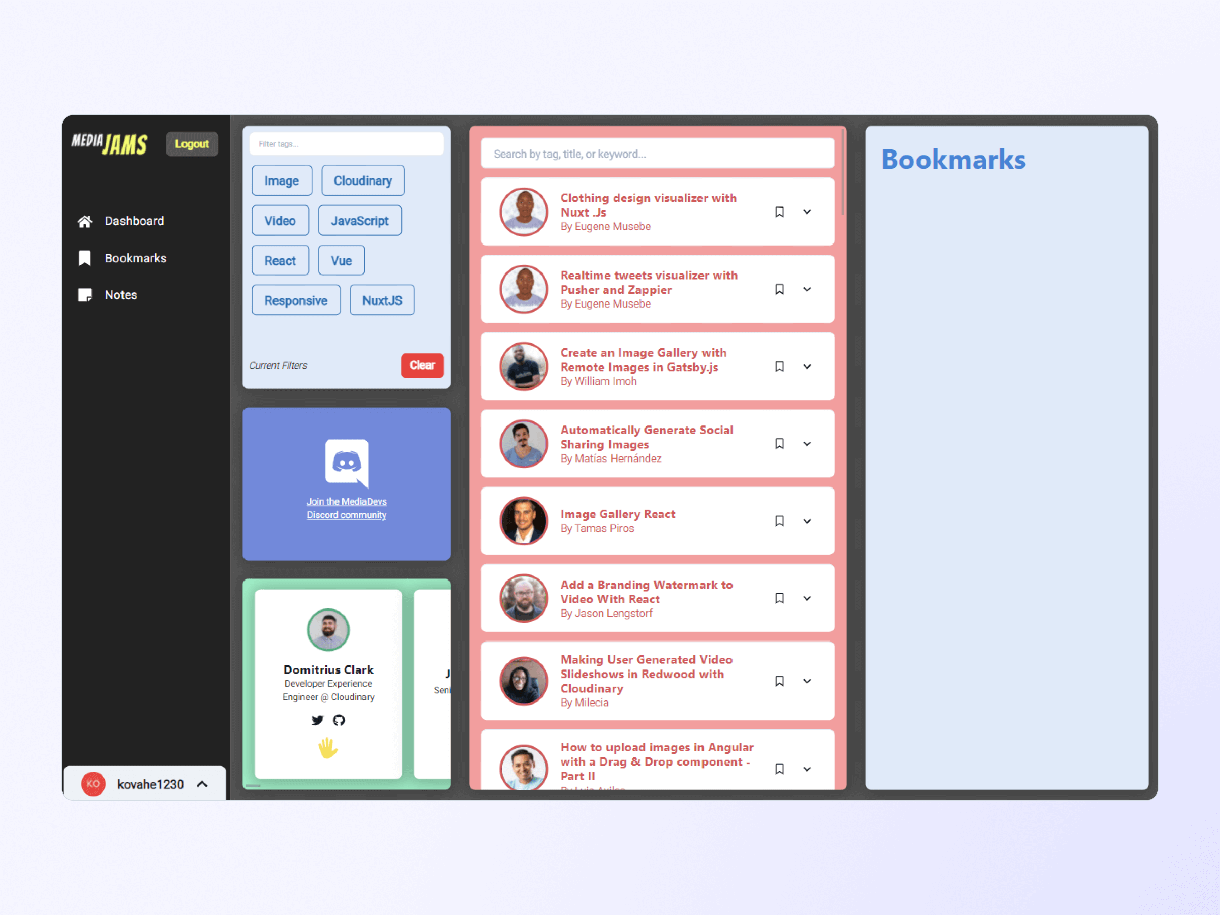
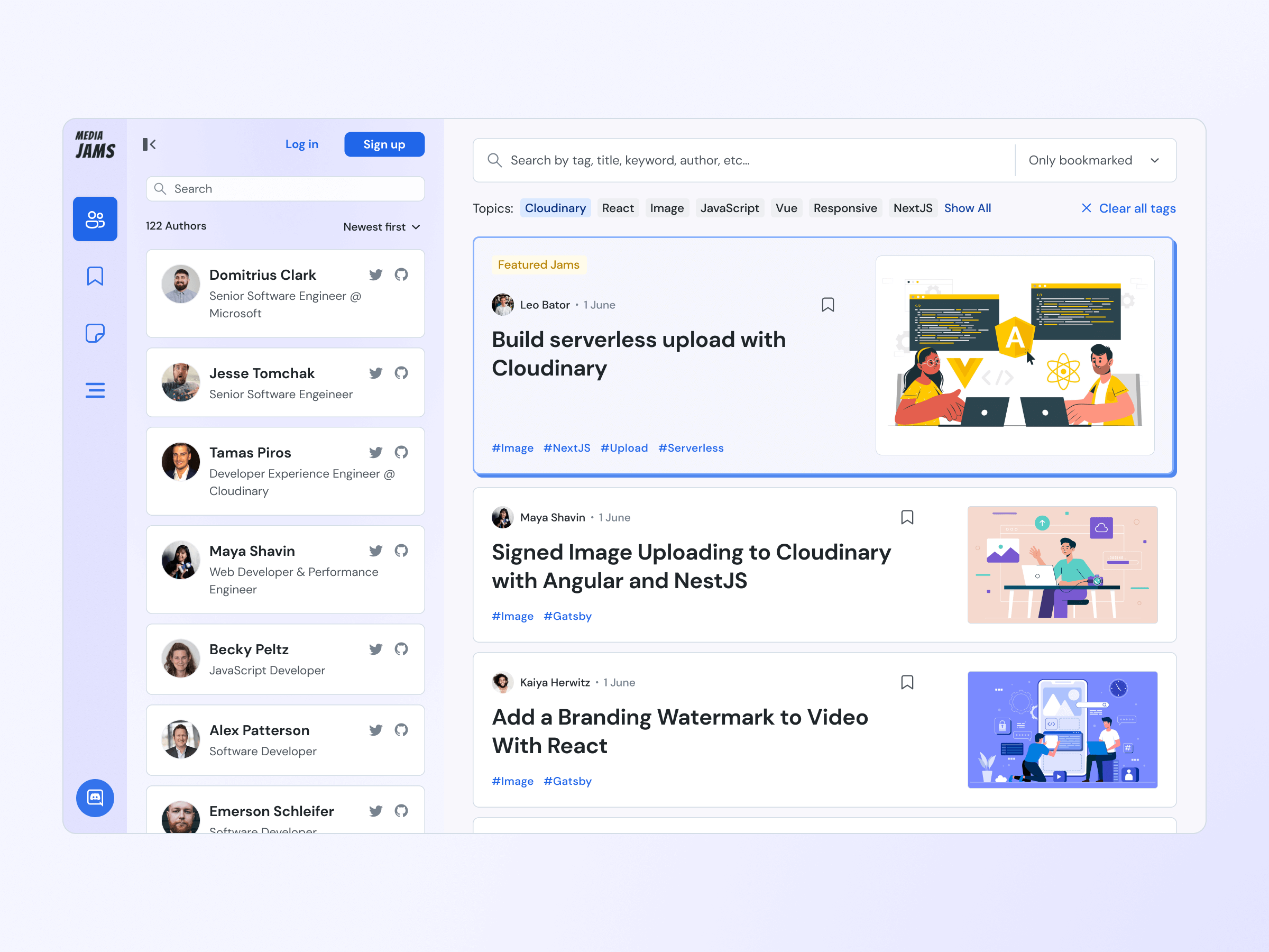

Fully responsive dev learning platform design with the ability to do some notes during reading, bookmark, follow authors, quickly navigate from any page. Design system and clear guidelines for further development including detailed typography and spacing.
Let’s discuss your goals, challenges, and how WebFolks can help you move forward.