

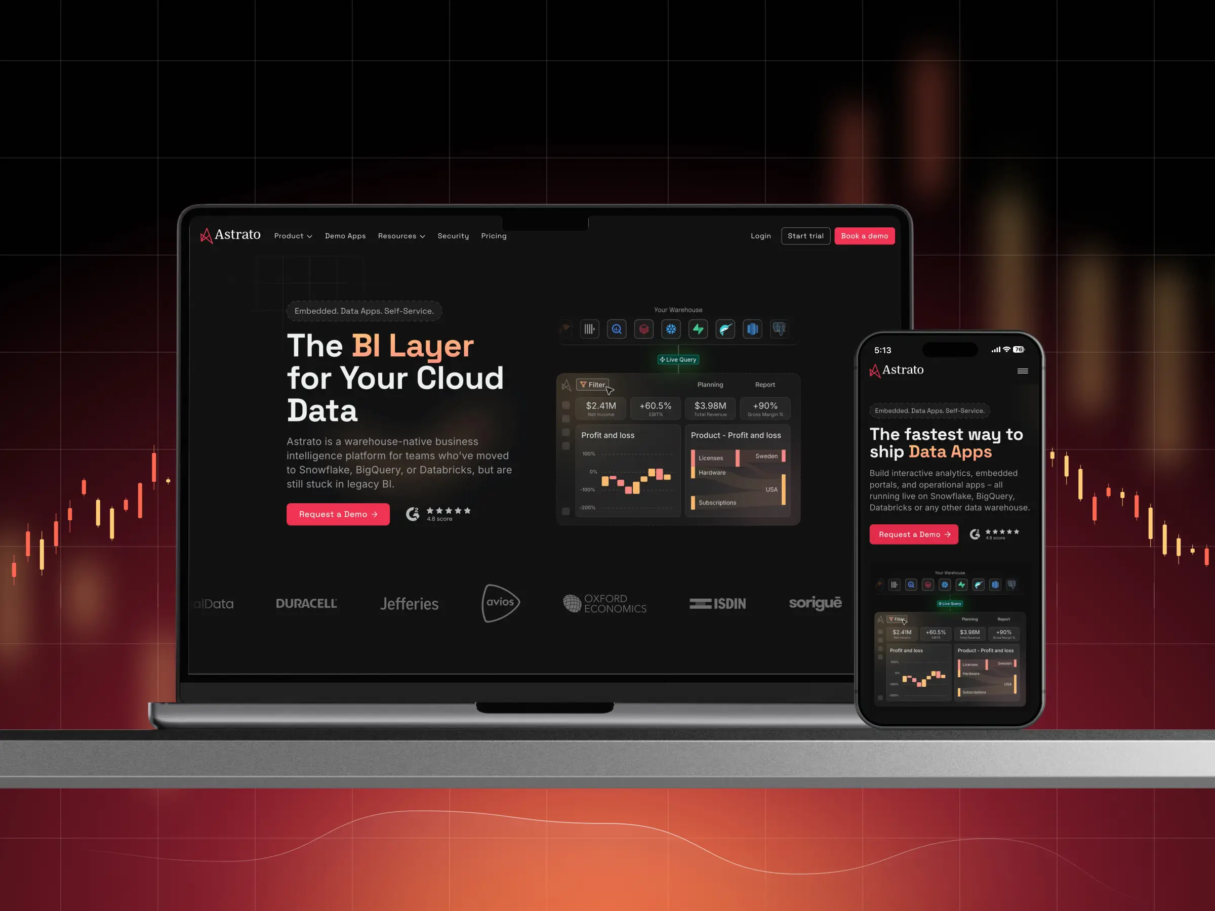
Astrato is a warehouse-native business intelligence platform. It lets data teams build live dashboards, embedded analytics, and operational data apps that run directly on their cloud warehouse – Snowflake, BigQuery, Databricks and others – with no data extracted or copied, plus the AI, security, and governance modern data teams rely on.
Our goal was to refresh Astrato’s digital presence and better communicate the value of its warehouse-native business intelligence platform.


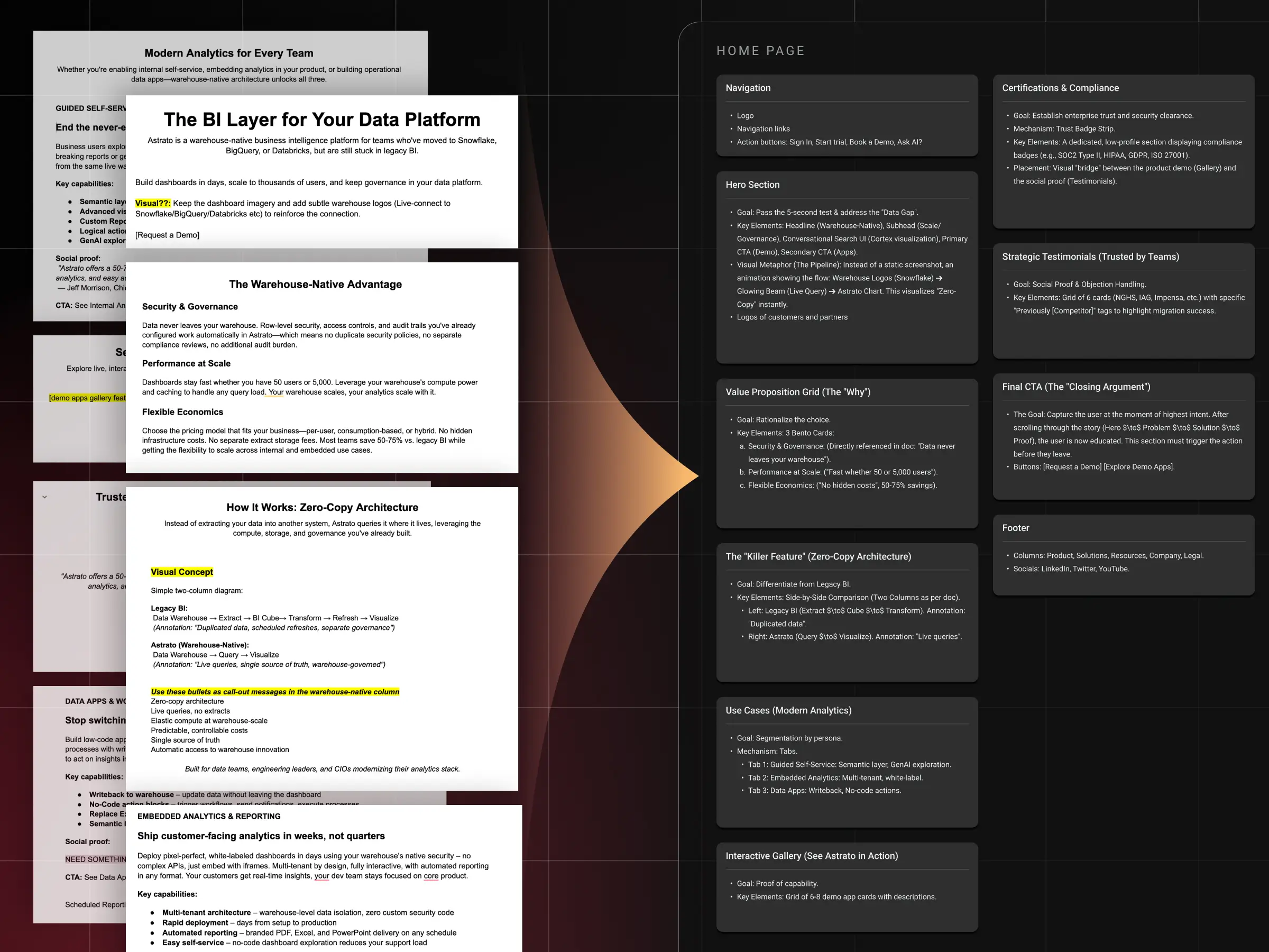
Astrato handed us finalized copy and references, but no structure. We mapped every block into a mind map and reshaped it into a clear flow.
Locking the narrative early kept every later design decision grounded and saved hours of redrawing visuals around an unsettled story.
Astrato handed us finalized copy and references, but no structure. We mapped every block into a mind map and reshaped it into a clear flow.
Locking the narrative early kept every later design decision grounded and saved hours of redrawing visuals around an unsettled story.
Astrato handed us finalized copy and references, but no structure. We mapped every block into a mind map and reshaped it into a clear flow.
Locking the narrative early kept every later design decision grounded and saved hours of redrawing visuals around an unsettled story.
Astrato handed us finalized copy and references, but no structure. We mapped every block into a mind map and reshaped it into a clear flow.
Locking the narrative early kept every later design decision grounded and saved hours of redrawing visuals around an unsettled story.
Astrato handed us finalized copy and references, but no structure. We mapped every block into a mind map and reshaped it into a clear flow.
Locking the narrative early kept every later design decision grounded and saved hours of redrawing visuals around an unsettled story.
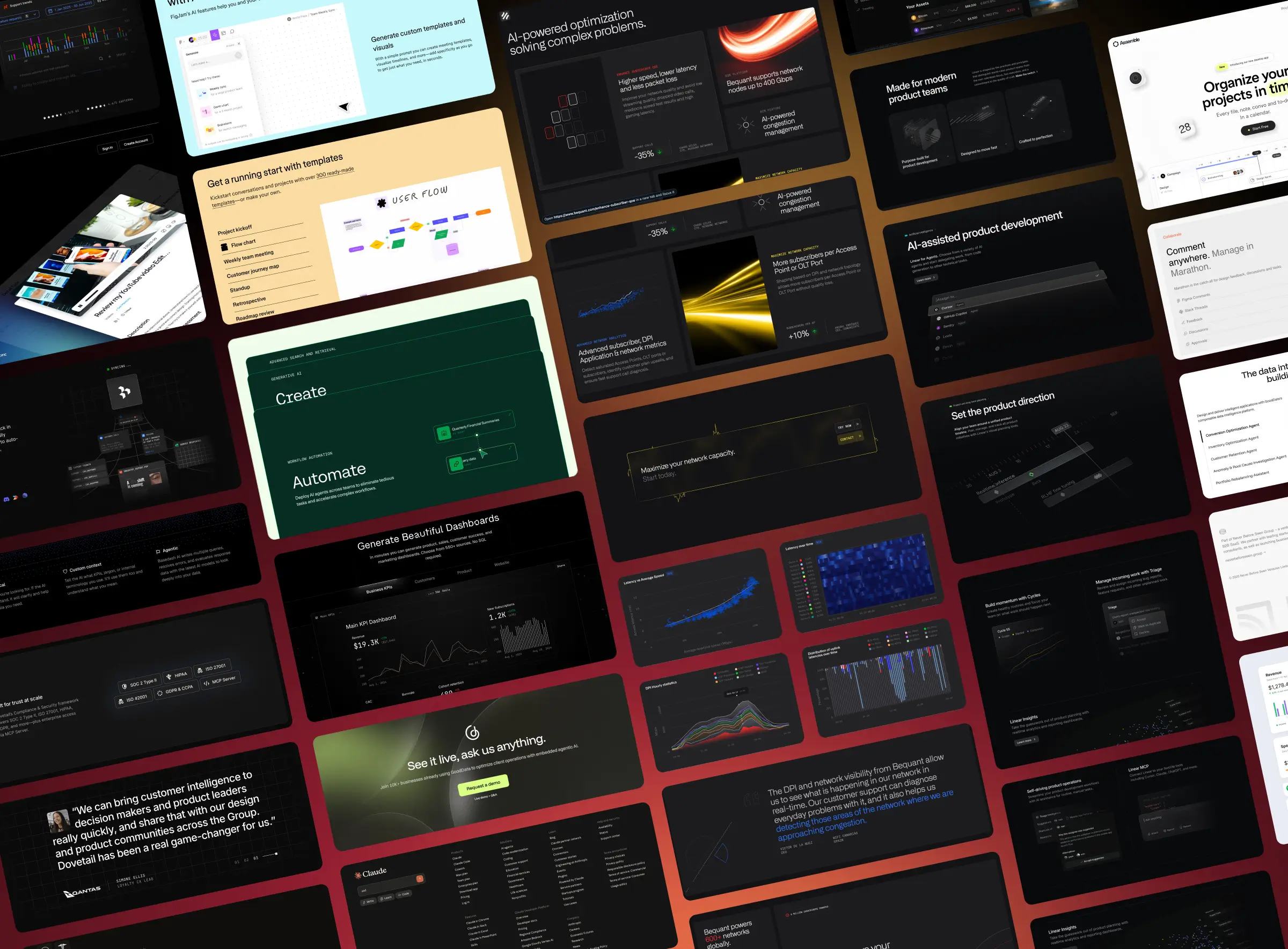
We studied Astrato's competitive landscape: BI platforms and modern dark-theme SaaS sites. Collected references for layout, visual storytelling, and the "premium, futuristic, but clean" feel the client wanted.
We studied Astrato's competitive landscape: BI platforms and modern dark-theme SaaS sites. Collected references for layout, visual storytelling, and the "premium, futuristic, but clean" feel the client wanted.
We studied Astrato's competitive landscape: BI platforms and modern dark-theme SaaS sites. Collected references for layout, visual storytelling, and the "premium, futuristic, but clean" feel the client wanted.
We studied Astrato's competitive landscape: BI platforms and modern dark-theme SaaS sites. Collected references for layout, visual storytelling, and the "premium, futuristic, but clean" feel the client wanted.
We studied Astrato's competitive landscape: BI platforms and modern dark-theme SaaS sites. Collected references for layout, visual storytelling, and the "premium, futuristic, but clean" feel the client wanted.
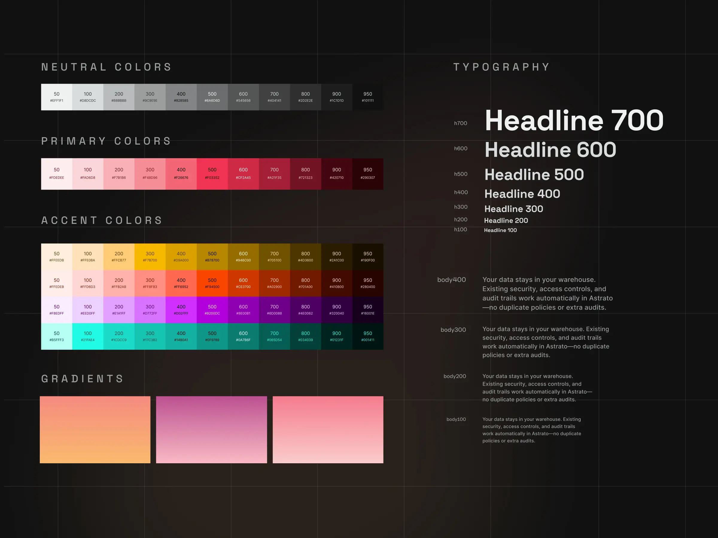
Astrato already had a brand book, so we adapted their palette into a refined dark theme instead of starting over.
We preserved the brand's display typeface for headlines and swapped the body font for stronger readability, then compiled colors, gradients, type, and components into a reusable UI Kit.
Astrato already had a brand book, so we adapted their palette into a refined dark theme instead of starting over.
We preserved the brand's display typeface for headlines and swapped the body font for stronger readability, then compiled colors, gradients, type, and components into a reusable UI Kit.
Astrato already had a brand book, so we adapted their palette into a refined dark theme instead of starting over.
We preserved the brand's display typeface for headlines and swapped the body font for stronger readability, then compiled colors, gradients, type, and components into a reusable UI Kit.
Astrato already had a brand book, so we adapted their palette into a refined dark theme instead of starting over.
We preserved the brand's display typeface for headlines and swapped the body font for stronger readability, then compiled colors, gradients, type, and components into a reusable UI Kit.
Astrato already had a brand book, so we adapted their palette into a refined dark theme instead of starting over.
We preserved the brand's display typeface for headlines and swapped the body font for stronger readability, then compiled colors, gradients, type, and components into a reusable UI Kit.
To show the product without overwhelming the visitor, we refreshed and rebuilt the key dashboard graphics and feature illustrations.
Under tight deadlines we redrew the highest-impact visuals from scratch, reusing existing assets where it made sense, and tailoring select library illustrations for the bento cards so every tile stayed on-brand and purposeful.
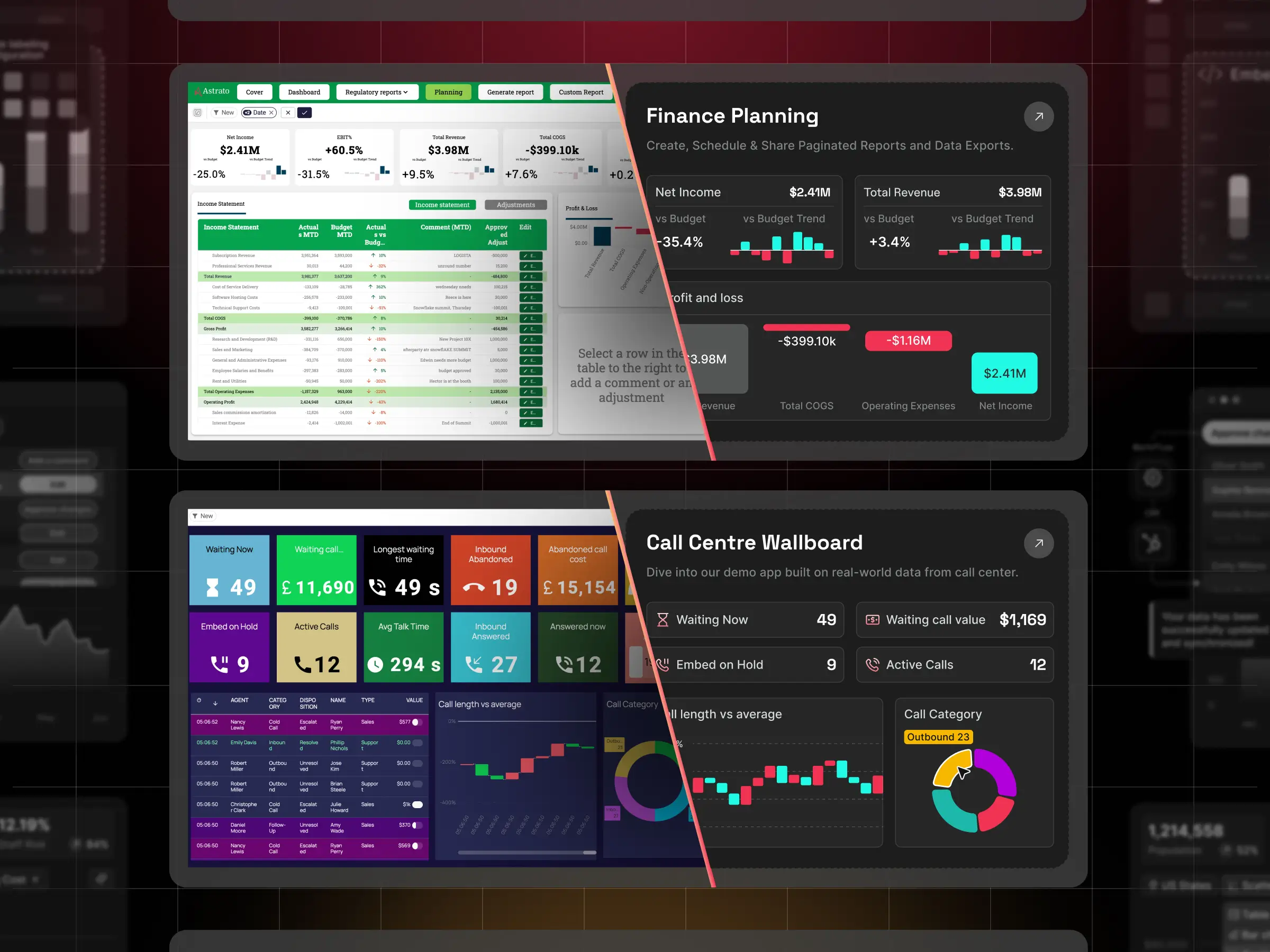
To show the product without overwhelming the visitor, we refreshed and rebuilt the key dashboard graphics and feature illustrations.
Under tight deadlines we redrew the highest-impact visuals from scratch, reusing existing assets where it made sense, and tailoring select library illustrations for the bento cards so every tile stayed on-brand and purposeful.
To show the product without overwhelming the visitor, we refreshed and rebuilt the key dashboard graphics and feature illustrations.
Under tight deadlines we redrew the highest-impact visuals from scratch, reusing existing assets where it made sense, and tailoring select library illustrations for the bento cards so every tile stayed on-brand and purposeful.
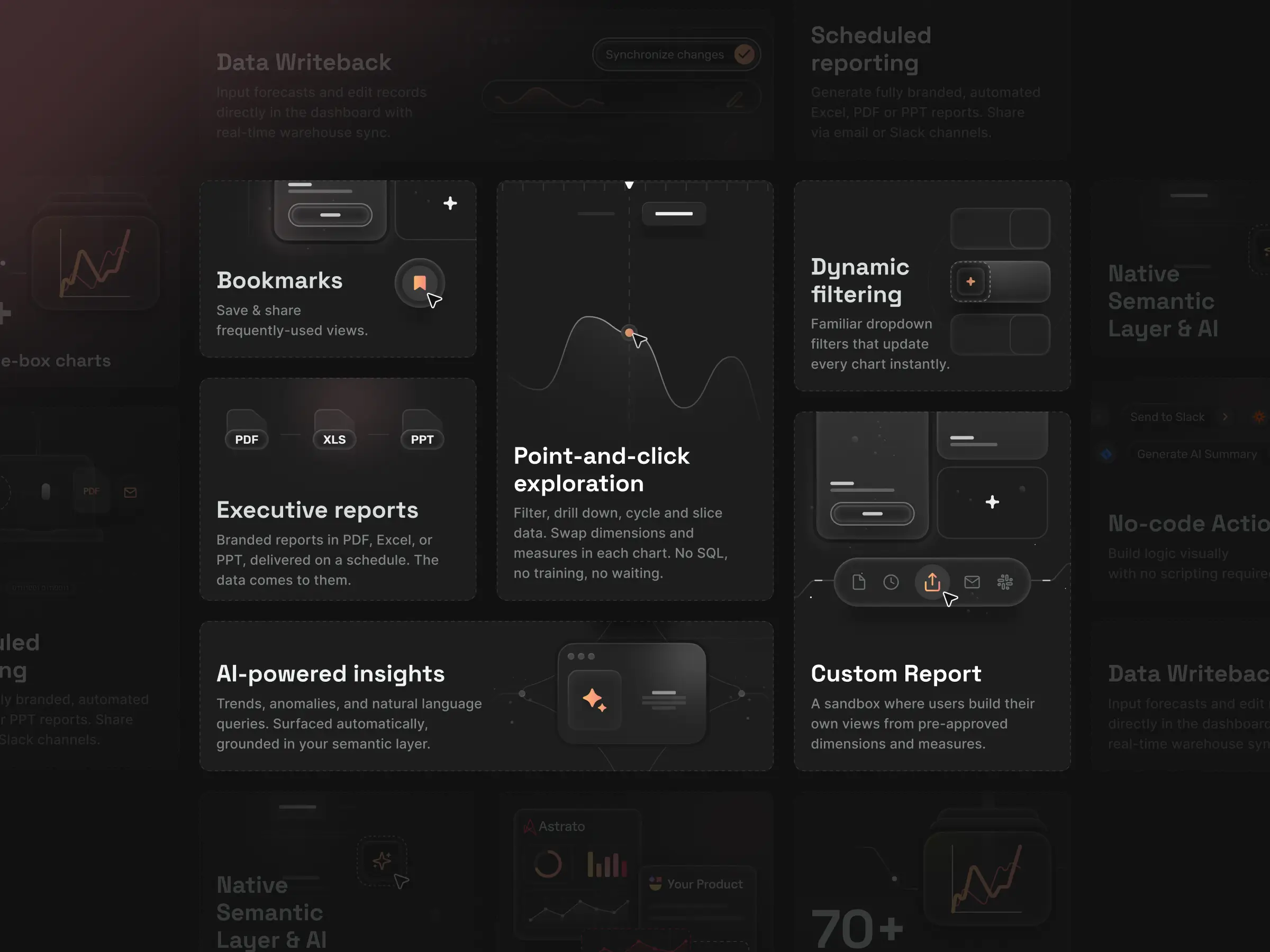
To show the product without overwhelming the visitor, we refreshed and rebuilt the key dashboard graphics and feature illustrations.
Under tight deadlines we redrew the highest-impact visuals from scratch, reusing existing assets where it made sense, and tailoring select library illustrations for the bento cards so every tile stayed on-brand and purposeful.
To show the product without overwhelming the visitor, we refreshed and rebuilt the key dashboard graphics and feature illustrations.
Under tight deadlines we redrew the highest-impact visuals from scratch, reusing existing assets where it made sense, and tailoring select library illustrations for the bento cards so every tile stayed on-brand and purposeful.
We designed, aligned, and implemented the pages in Webflow using a component-based approach.
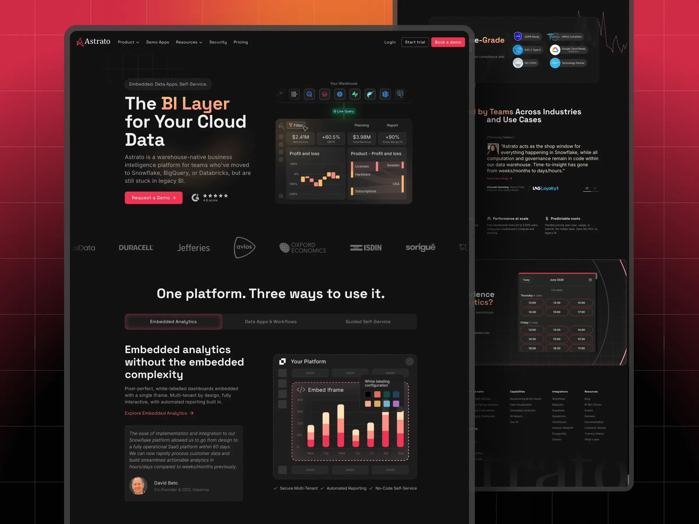
We designed, aligned, and implemented the pages in Webflow using a component-based approach.
We designed, aligned, and implemented the pages in Webflow using a component-based approach.
We designed, aligned, and implemented the pages in Webflow using a component-based approach.
We designed, aligned, and implemented the pages in Webflow using a component-based approach.
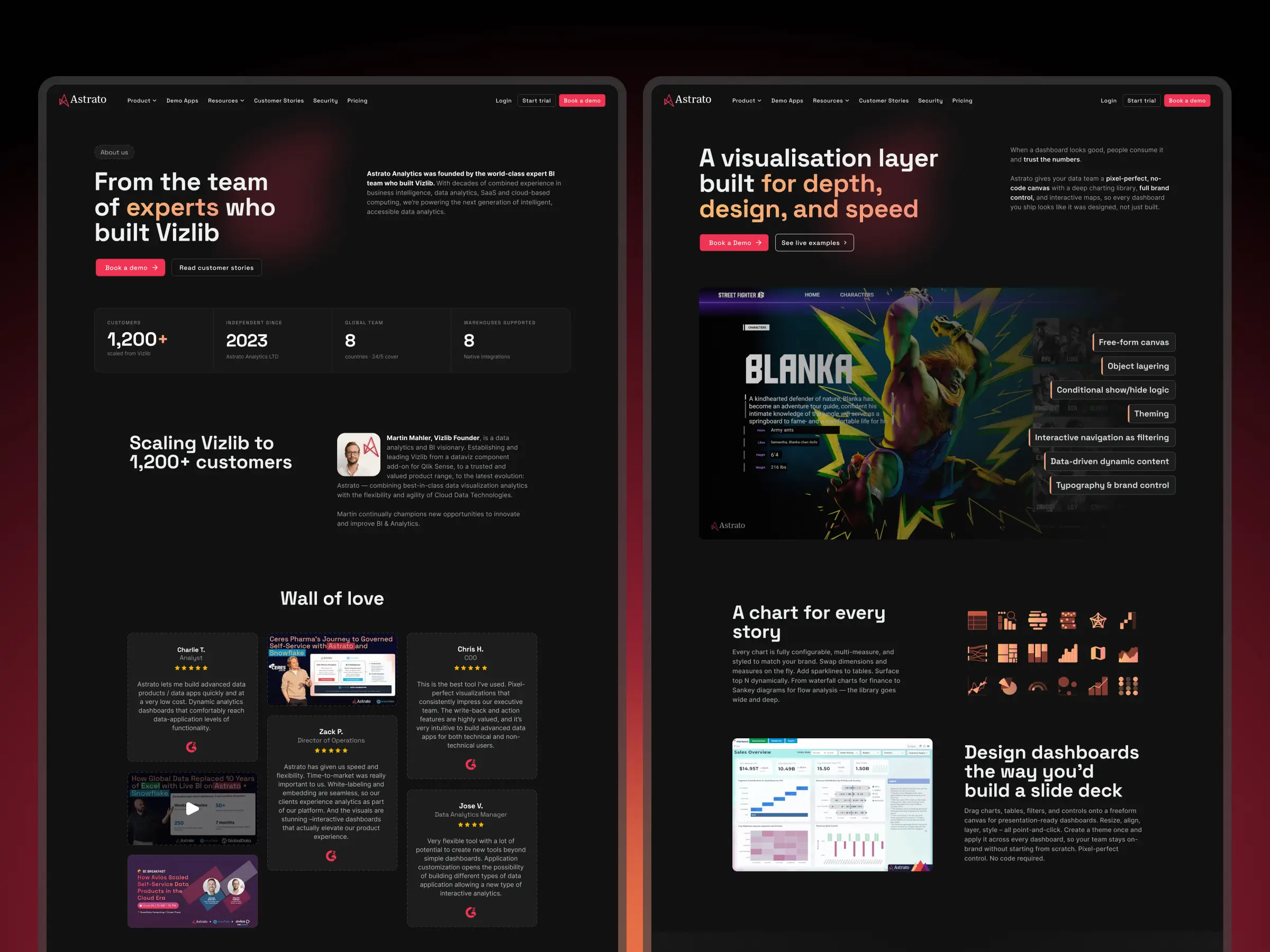
We redesigned the Customer stories collection to match the new dark brand. The existing CMS was researched, optimized, and stripped of unused fields, keeping the structure lean and easy for the team to maintain and extend.
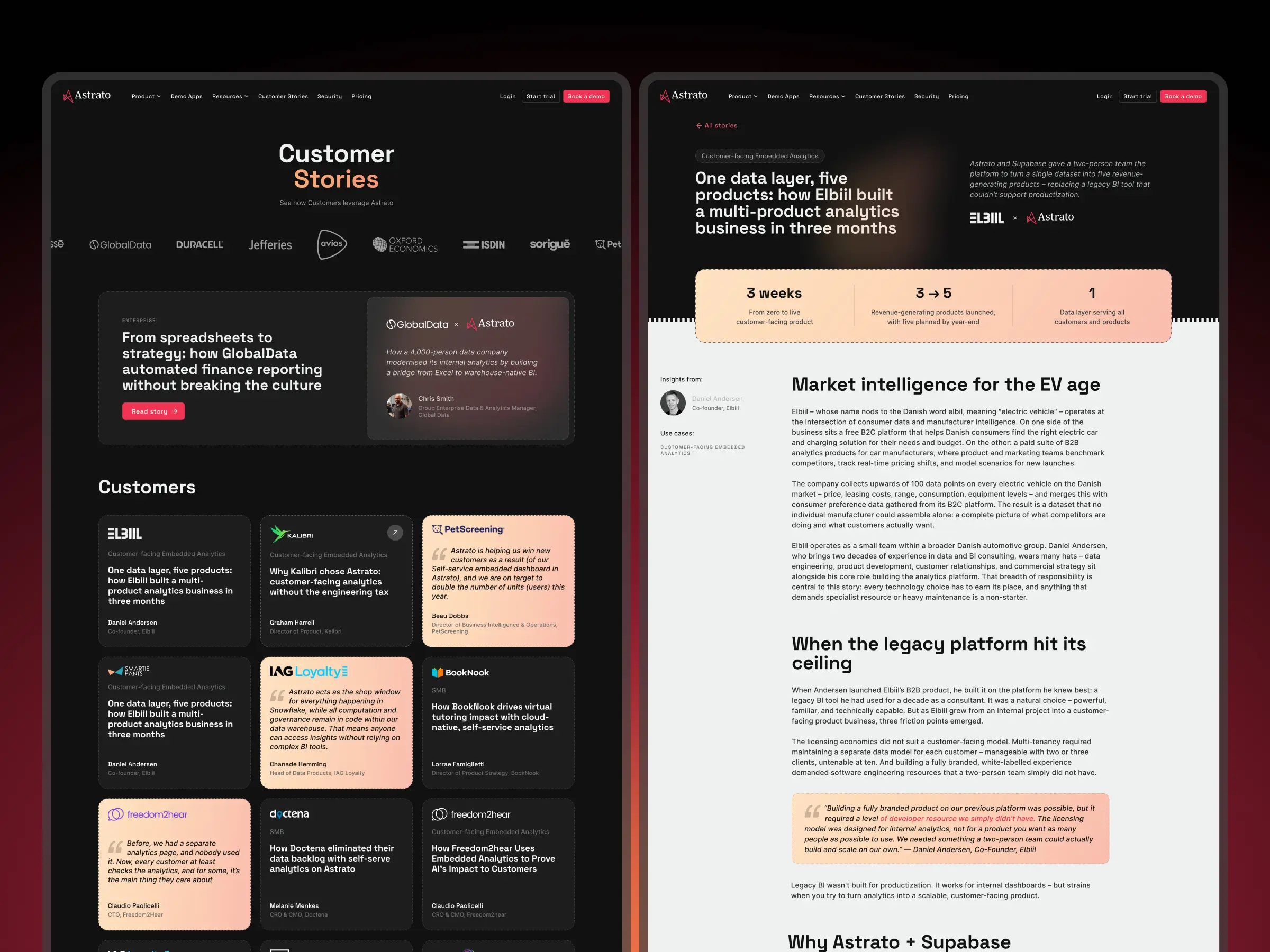
We redesigned the Customer stories collection to match the new dark brand. The existing CMS was researched, optimized, and stripped of unused fields, keeping the structure lean and easy for the team to maintain and extend.
We redesigned the Customer stories collection to match the new dark brand. The existing CMS was researched, optimized, and stripped of unused fields, keeping the structure lean and easy for the team to maintain and extend.
We redesigned the Customer stories collection to match the new dark brand. The existing CMS was researched, optimized, and stripped of unused fields, keeping the structure lean and easy for the team to maintain and extend.
We redesigned the Customer stories collection to match the new dark brand. The existing CMS was researched, optimized, and stripped of unused fields, keeping the structure lean and easy for the team to maintain and extend.
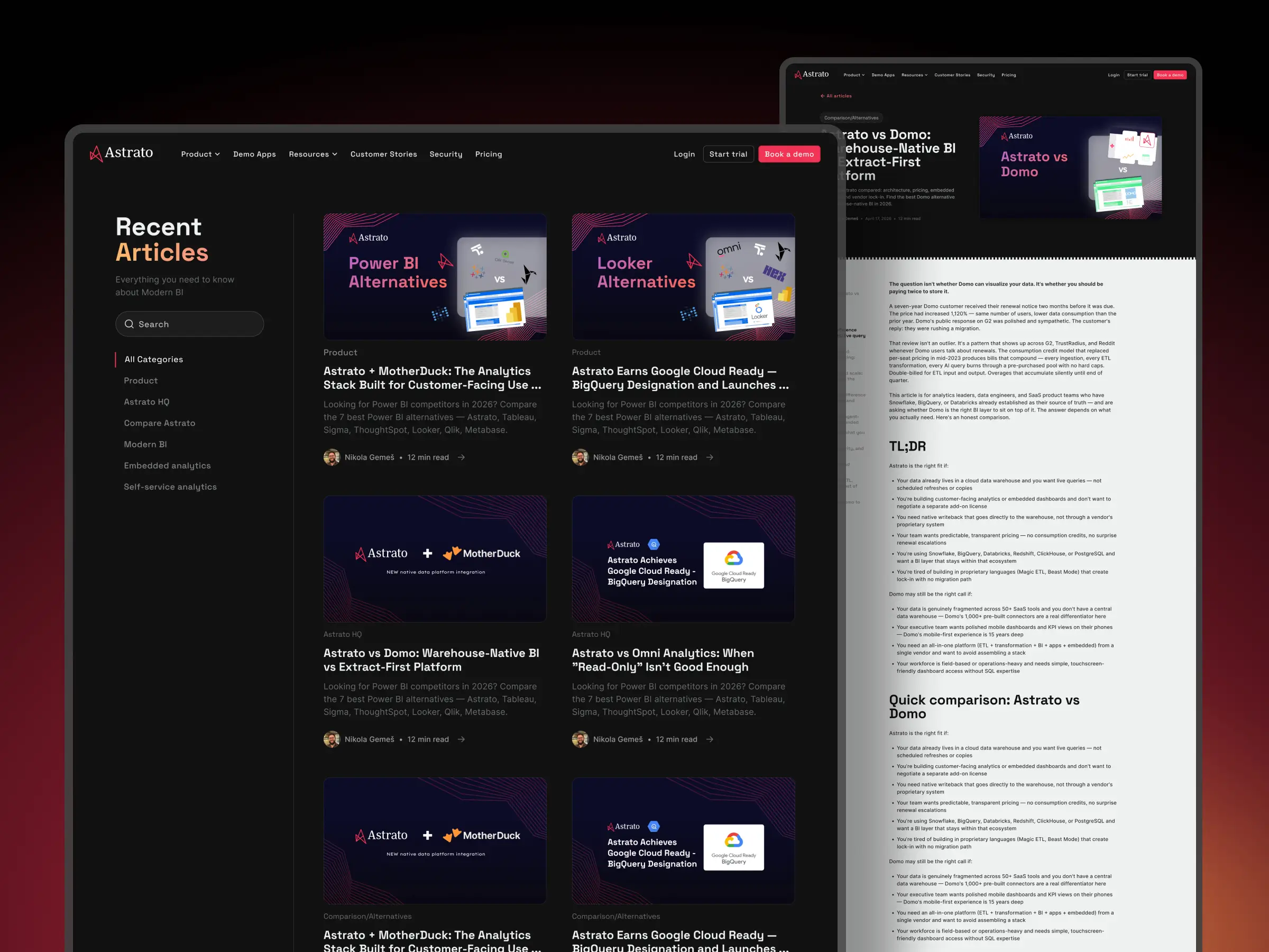
The Blog collection got the same treatment. A refreshed reading experience aligned to the new visual system, built on a cleaned-up CMS so publishing stays fast and consistent.
The Blog collection got the same treatment. A refreshed reading experience aligned to the new visual system, built on a cleaned-up CMS so publishing stays fast and consistent.
The Blog collection got the same treatment. A refreshed reading experience aligned to the new visual system, built on a cleaned-up CMS so publishing stays fast and consistent.
The Blog collection got the same treatment. A refreshed reading experience aligned to the new visual system, built on a cleaned-up CMS so publishing stays fast and consistent.
The Blog collection got the same treatment. A refreshed reading experience aligned to the new visual system, built on a cleaned-up CMS so publishing stays fast and consistent.
We built every section as a reusable Webflow component, so Astrato's team can edit content and assemble new pages on their own. No developer needed.
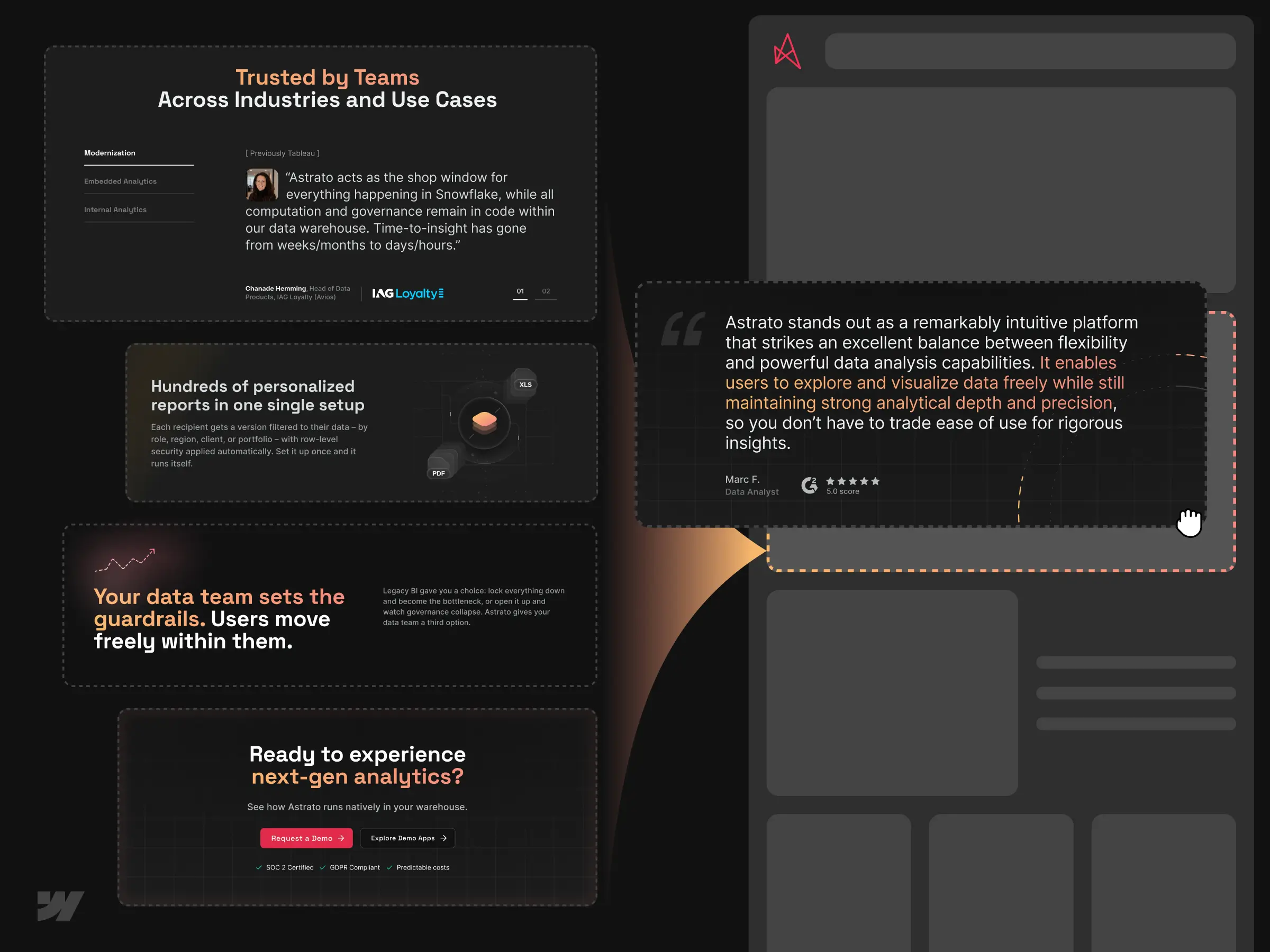
We built every section as a reusable Webflow component, so Astrato's team can edit content and assemble new pages on their own. No developer needed.
We built every section as a reusable Webflow component, so Astrato's team can edit content and assemble new pages on their own. No developer needed.
We built every section as a reusable Webflow component, so Astrato's team can edit content and assemble new pages on their own. No developer needed.
We built every section as a reusable Webflow component, so Astrato's team can edit content and assemble new pages on their own. No developer needed.
Grounded in a clear structure, a refined dark brand, and custom visuals, the final site turns Astrato's complex product into an experience that's easy to read and a pleasure to scroll.
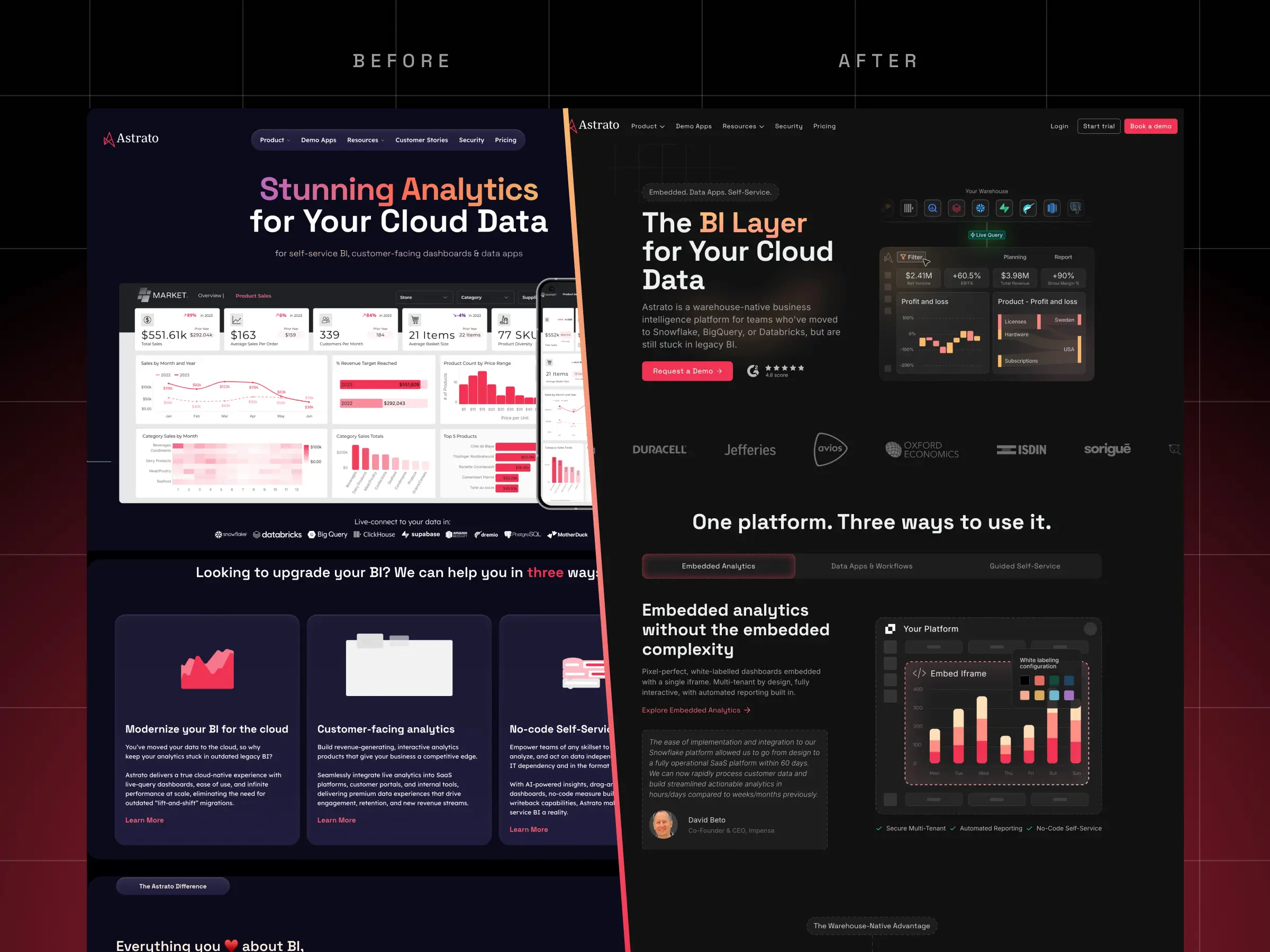
Grounded in a clear structure, a refined dark brand, and custom visuals, the final site turns Astrato's complex product into an experience that's easy to read and a pleasure to scroll.
Grounded in a clear structure, a refined dark brand, and custom visuals, the final site turns Astrato's complex product into an experience that's easy to read and a pleasure to scroll.
Grounded in a clear structure, a refined dark brand, and custom visuals, the final site turns Astrato's complex product into an experience that's easy to read and a pleasure to scroll.
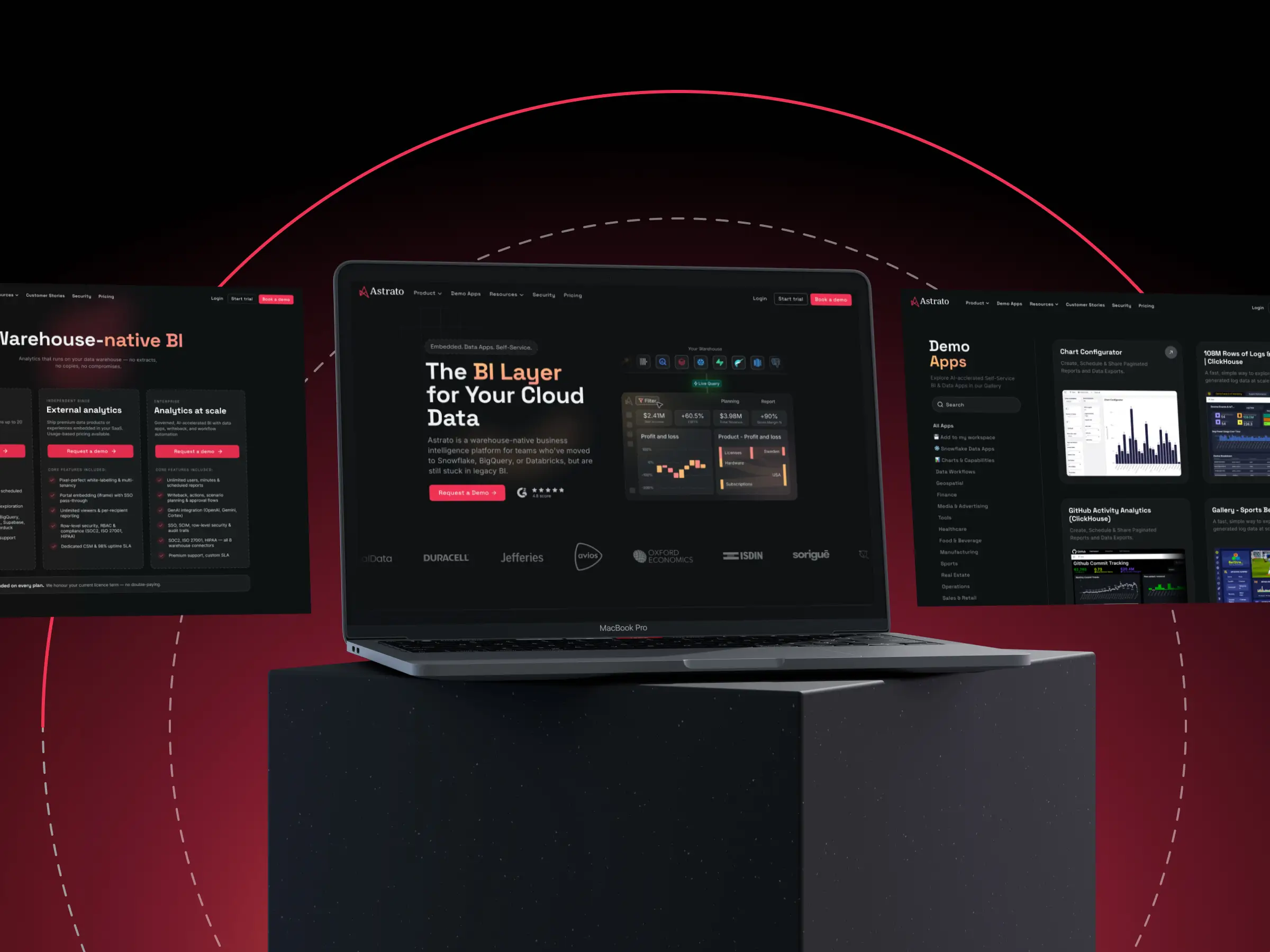
Grounded in a clear structure, a refined dark brand, and custom visuals, the final site turns Astrato's complex product into an experience that's easy to read and a pleasure to scroll.

Let’s discuss your goals, challenges, and how WebFolks can help you move forward.


We support the Ukrainian army that is defending our country. Friends and everyone willing to stand against russian terrorism – stand with Ukraine!


